Standard Image Size for web:
-72dpi (resolution)
-Usually not wider than 600px
How to save images for Web:
****BE SURE**** NOT to save your original images as web size!!!! RESIZE DUPLICATES ONLY!! Saving an image for web shrinks it and you won't be able to get the original size back!! So it must be done on a duplicate ****
So first, make duplicates of all your master retouched files that are most likely TIFFS if they have layers. If you have them all in a folder, go to FILE > SCRIPTS > IMAGE PROCESSOR. Make them all JPGS in a new folder (do not reduce file size). Should look like this (it will create a new folder of duplicates):
Then....
Save this folder of duplicates to web size by going to FILE > SAVE FOR WEB. This automatically makes the new images 72dpi.
Be sure to save as JPEGs that are approx 600px wide:
Batch Save a Whole Folder Web Size by writing an ACTION:
If you want to save a whole folder of images at web size, you can write an action:
1.) Open an image
2.) WINDOW > ACTIONS to make your actions tab visible.
3.) Make a new action by clicking the "new action" icon at the bottom (looks like a page with the corner folded). Name it, and then RECORDING starts when red light is on!
4.) First thing to record: IMAGE > IMAGE SIZE. Change "pixel dimensions" width to 600 px. (Don't change resolution or document size. Leave all boxes checked at the bottom. Have "Bicubic Automatic" selected)
5.) Now go to FILE > SAVE FOR WEB. Be sure to have optimized checked and to save as a "high" 60 quality JPEG, Optimized checked. At the bottom choose Bicubic Sharper (this is best for downsizing images). ** You don't need to change image size- it should already be set to 600px wide.
6.) Click "Save" and have it go to a folder you've called "web size images". (Don't rename images, as it can throw off the action. You can rename later in Bridge via TOOLS > BATCH RENAME). Close the image. Don't Save.
7.) Stop your action by hitting the square "stop" button at the bottom of the actions palette.
8.) This has now saved a duplicate of the image as web size! You can now go to FILE > AUTOMATE > BATCH to run that action on a whole folder of images.
Each resulting image should be 600px wide at 72 dpi and ready to email or publish online (to check, go to IMAGE > IMAGE SIZE):
*Sometimes you may notice that once your images appear online they look a little desaturated. If so, you can always go back and boost colors in Photoshop with an S Curve or by adding a little saturation with an adjustment layer, and then re-publishing it online.
*****
Embedding Copyright, Naming Files & Watermarking:
File naming: Using Bridge, you can rename all your files to be consistent and have your name in them, for example, gleeson_web_01.jpg, gleeson_web_02.jpg, gleeson_web_03.jpg...
*I like to name my files with "web" or "Print" in the title so I know which size each JPG is and don't accidentally print a web size image. In Bridge TOOLS > BATCH RENAME (be sure to have the images you want to rename highlighted for it to work).
Copyright: In Bridge, you can create a new Metadata template with all your info in it. Go to TOOLS > CREATE METADATA TEMPLATE. Then in the future, you can apply this to any image you want by going to TOOL > REPLACE METADATA.
Watermarking: In Bridge via the Output Tab, you can make a PDF that has watermarked images either with text or a logo.
Creating an Online Portfolio:
If you don't have a website, you may think about trying this free online portfolio service called Carbon Made: http://carbonmade.com. Here's an examples of a portfolios by a former students of mine: http://hanspurwa.carbonmade.com/ http://dianabphoto.carbonmade.com
Another option that connects to Flickr is http://pullfolio.com
I use Photo Biz, photobiz.com, for my website www.eringleeson.com. It's a drag and drop template for people like me who don't know HTML and web design. Super user friendly, and is about $15/month.
Some free blog formats that are available are Blogger (via gmail), Wordpress (highly customizable templates), Tumblr (built in social media). Each of these offer templates you can buy.
For example, my website/blog The Forest Feast is a Tumblr blog. Although my template is not as customizable as a Wordpress template might be, I wanted to built in social media aspect to attract followers and drive traffic. I bought a $75 template from Pixel Union, and because I wanted something more memorable than forestfeast.tumblr.com, I went to Go Daddy and bought the domain name www.theforestfeast.com and had the 2 connected, for approx $15/year.
Art 35 at Stanford Continuing Studies, Spring 2013
Thursday, May 30, 2013
Choosing the Right Lens
Prime Lenses: Don't zoom, they are fixed in one position. Advantage: generally cheaper and produce more sharpness/crispness/clarity. Disadvantage: you have to switch lenses often or move around! And you may have to buy several prime lenses to cover your bases, instead of one zoom lens.
Zoom Lenses:
Advantage: you don't have to move as much to get the shot you want, and don't have to switch lenses often. Disadvantage: more expensive, heavier, less sharpness.
What's the Difference between Fast and Slow Lenses?
"Fast" Lenses = you can shoot in lower light (fast lenses go to a low F-stop number, like F1.8 or F2.8)
"Slow" lenses = not great in low-light (slow lenses don't generally go to an F-stop number lower than F4 or F5.6)
Lenses are measured in length, by Millimeters (mm):
-Wide Angle (16mm, 24mm, 35mm...): show more of the scene
-Long (100mm, 200mm, 300mm...): Shoot things farther away (like a telephoto lens)
-Mid-range "normal" lenses are somewhere in between (40mm to 80mm? although it depends on the size of your sensor because lenses on full frame cameras will appear wider...see below).
Longer Lenses Condense the Background. See example image below (image credit: Lynda.com):
Image on left: 100mm lens. Image on right: 24mm lens. (The photographer shot with a zoom lens and walked closer to the subject when taking the the wide angle shot on the right to be able to crop it the same.)
See how the background looks more condensed and closer in the image on the left? This can also be more flattering when taking portraits, as it doesn't spread the features as much (image credit here.)
Image on left: wide angle lens (24mm?). Image on right: longer lens (100mm?).
How does your sensor affect your lens?
Cameras with a full frame sensor will make lenses seem wider. (These are generally more expensive or professional cameras so may not affect you). If you upgrade your DSLR to a full frame sensor camera, you may notice your lenses suddenly seem wider. (Some lenses may not be compatible when you upgrade).
In addition to an offered aperture (like F2.8) and length (like 50mm), lenses also contributes to the overall Color, Contrast and Sharpness of your image. Whereas these elements can be added later in Photoshop, it can often be to your advantage if it's done in the camera and offer a unique creative style.
Zoom Lenses:
Advantage: you don't have to move as much to get the shot you want, and don't have to switch lenses often. Disadvantage: more expensive, heavier, less sharpness.
What's the Difference between Fast and Slow Lenses?
"Fast" Lenses = you can shoot in lower light (fast lenses go to a low F-stop number, like F1.8 or F2.8)
"Slow" lenses = not great in low-light (slow lenses don't generally go to an F-stop number lower than F4 or F5.6)
Lenses are measured in length, by Millimeters (mm):
-Wide Angle (16mm, 24mm, 35mm...): show more of the scene
-Long (100mm, 200mm, 300mm...): Shoot things farther away (like a telephoto lens)
-Mid-range "normal" lenses are somewhere in between (40mm to 80mm? although it depends on the size of your sensor because lenses on full frame cameras will appear wider...see below).
Longer Lenses Condense the Background. See example image below (image credit: Lynda.com):
Image on left: 100mm lens. Image on right: 24mm lens. (The photographer shot with a zoom lens and walked closer to the subject when taking the the wide angle shot on the right to be able to crop it the same.)
See how the background looks more condensed and closer in the image on the left? This can also be more flattering when taking portraits, as it doesn't spread the features as much (image credit here.)
Image on left: wide angle lens (24mm?). Image on right: longer lens (100mm?).
How does your sensor affect your lens?
Cameras with a full frame sensor will make lenses seem wider. (These are generally more expensive or professional cameras so may not affect you). If you upgrade your DSLR to a full frame sensor camera, you may notice your lenses suddenly seem wider. (Some lenses may not be compatible when you upgrade).
Thursday, May 23, 2013
Creative Filters and Collage
Adding Texture/ Blending Mode Multiply
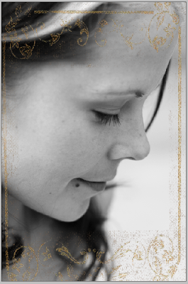
To create antiquing effects, you can use images found online or you can shoot or scan textures you like. You can also photograph textures specifically for this technique. Drag the antique paper (or whatever texture you've found) to the top layer of your image. Change the blending mode of that layer to MULTIPLY and adjust the opacity as needed.
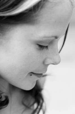
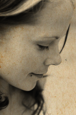
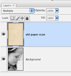
Notice the blending mode of the layer with the paper scan is "Multiply". You can also make a mask, and paint in with black and a low opacity brush to lessen the effect on certain areas of the image (like the face).
Extracting elements of scans for collage:
I scanned this old book because I liked the gold leaf border:
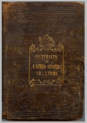
Select a certain area by using Select > Color Range (or the magic wand tool). I made a selection of the gold border and copied and pasted it into a new empty layer (command C, command V).
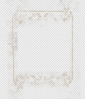
Use 'Command T' (free transform) to change the size of the border to fit your image.
Download-able textures:
http://www.mayang.com/textures/
Here's a similar image with multiple layers:
ACTIONS:
You can write your own action by opening your actions tab and clicking the new action icon at the bottom (page with corner folded). Anything you do will be recorded (until you press stop). You may consider recording a series of adjustment layers (like de-saturation, increased contrast, black and white, sepia etc) for an effect you like, then you can play it again later on another image.
PRESETS:
Presets are just for the RAW window. You can write your own and record the steps you have done (all the sliders you have adjusted) on the Presets Tab. (see below) You can also download Presets. You may consider de-saturation, increased contrast,and adding a vignette.
PLUG-INS:
There are a variety of downloadable plugins which have automated effects and which you launch through the Photoshop interface (usually via File > Automate). Some are free and others you have to buy. Some good ones are:
http://www.ononesoftware.com/products/suite7/
http://www.alienskin.com/exposure/
http://www.niksoftware.com/nikcollection/usa/intro.html
To create antiquing effects, you can use images found online or you can shoot or scan textures you like. You can also photograph textures specifically for this technique. Drag the antique paper (or whatever texture you've found) to the top layer of your image. Change the blending mode of that layer to MULTIPLY and adjust the opacity as needed.


Notice the blending mode of the layer with the paper scan is "Multiply". You can also make a mask, and paint in with black and a low opacity brush to lessen the effect on certain areas of the image (like the face).
Extracting elements of scans for collage:
I scanned this old book because I liked the gold leaf border:

Select a certain area by using Select > Color Range (or the magic wand tool). I made a selection of the gold border and copied and pasted it into a new empty layer (command C, command V).

Use 'Command T' (free transform) to change the size of the border to fit your image.

Download-able textures:
http://www.mayang.com/textures/
Here's a similar image with multiple layers:
ACTIONS:
You can write your own action by opening your actions tab and clicking the new action icon at the bottom (page with corner folded). Anything you do will be recorded (until you press stop). You may consider recording a series of adjustment layers (like de-saturation, increased contrast, black and white, sepia etc) for an effect you like, then you can play it again later on another image.
PRESETS:
Presets are just for the RAW window. You can write your own and record the steps you have done (all the sliders you have adjusted) on the Presets Tab. (see below) You can also download Presets. You may consider de-saturation, increased contrast,and adding a vignette.
PLUG-INS:
There are a variety of downloadable plugins which have automated effects and which you launch through the Photoshop interface (usually via File > Automate). Some are free and others you have to buy. Some good ones are:
http://www.ononesoftware.com/products/suite7/
http://www.alienskin.com/exposure/
http://www.niksoftware.com/nikcollection/usa/intro.html
Thursday, May 16, 2013
Compositing: Combining Images
When you combine elements from different images into one, it's called compositing. The main task in doing this is "Selection". You can select a certain area of an image to paste it elsewhere using several different methods. For items with hard defined edges (like a basket ball), you could use the magnetic lasso, magic wand or the (most precise) pen tool. The Pen Tool creates a path, which can then be turned into a selection.
For areas with fuzzy outlines, like a furry cat or someone's hair, making a selection using Refine Edge can be more successful.
Compositing with Quick Selection Tool:
- Place the image of the subject on top of it’s new background
- 2.) Using the quick selection tool, make a selection of the subject. Use a small brush for detailed areas and to be more precise. Hold down command for the “minus” tool.
- Select > Refine Edge. Use the “On layers” view.
- Use the refine radius tool ( next to edge detection” to go around edges, especially hair.
- Export as a layer mask. Continue to refine the mask with black or white brushes as needed
Compositing with Channels:
Below, I used a Channels mask to select a bird and place it on a new background. The photo is by one of your fellow students, Dona Foster. The new background (her idea) is a scanned in piece of old paper. This image worked especially well because there was a monotone background.
Pen Tool:
The Pen tool is the most precise way to select an area of an image. For example, if you want to cut someone out of an image and place them on a new background, you can trace the outline of the person most accurately with the pen tool.
The Pen tool does not write, it is just used to make a selection. You use it to make a path: a path is created by making several points on the perimeter of a that person you want to cut out . You then "connect the dots" to create an outline. This series of "dots" or anchors that you make is called a path. To see your path as it's created, go to WINDOW > PATHS and make sure there is a check next to it.
I generally work clockwise around the perimeter of an object to make a path. Make sure you are zoomed WAY in (like to 200%). Click to make an anchor. Click and pull to make an anchor with 2 arms that will create a curve.
After tracing around the entire bottle with the pen tool, I turned the path into a selection by clicking the little dotted circle at the bottom of the paths palette. (Path and anchors must be live/visible for this to work. If it's not working, click on your path with the pen tool until you can see the anchor points. Then click the dotted circle).
Notice the order of my layers above. On new separate layer under the bottle, fill that same shape with gray. EDIT > FILL with 50% gray. Lower the opacity and FILTER > BLUR> GAUSSIAN BLUR to make the shadow look more natural. Command T (EDIT > FREE TRANSFORM) to make the shadow change position. You can also try EDIT > TRANSFORM > SKEW:
Friday, May 10, 2013
Curves Dodge & Burn
You can use a Curves adjustment layer to brighten (dodge) or darken (burn) selective areas of an image.
For example, in the image below, I added one Dodge layer to brighten select areas. The result is an image that looks more dynamic and less flat:
In your adjustments palette, choose the Curves icon. Drag from the middle up for brightening, or down for darkening:
This automatically makes a mask for you. Invert the mask (command i) and then paint with a WHITE SOFT BRUSH on the mask, just on the areas where you want to see the change.
Remember, on a mask: White reveals, Black conceals. Above, I have painted with white JUST where I want the change to show through.
Thursday, May 9, 2013
Preparing your Photos for Print
General Retouching Checklist (before you print):
-Be sure you are working from your "Master" image (the one you've retouched) that is saved as a TIFF with layers.
-Does your image look OK overall in terms of color? The best way to fix a color cast is with the color temperature slider in Camera Raw initially, but it can also be done later via the "color balance" adjustment layer. You can add a warming or cooling filter via the "photo filter" adjustment layer.
-Did you remove spots or dust using patch, healing, or stamp?
-Did you remove any unwanted objects by circling them with a lasso on a background copy layer and then filling with content aware?
-Did you add an "S-Curve" adjustment layer to slightly increase color and contrast?
-Do you need to selectively sharpen any areas? (see the previous post)
-If it's a landscape or architecture shot, do you need to straighten out any lines (lens correction)? This can be done on a background copy layer via EDIT > TRANSFORM > WARP
-Do you need to increase just one range of colors (like just the reddish hues in a flower, or just the bluish tones in the sky?). Adjustment layer "selective color" or "color balance" work well for this.
-Would you like to increase overall vibrance of colors with the Vibrance adjustment layer?
Color Management:
In Photoshop go to EDIT > COLOR SETTINGS to make sure that you have sRGB selected for your RGB working space.
*CMYK is only for commercial offset printing and doesn't generally apply to photographic printing we are likely to use. If you are doing work for a magazine or book and working directly with the printer, they will give you CMYK instructions specific to whatever printer they are using. As photographer, we are really just concerned with RGB settings.
Calibration:
To ensure that the images look as close as possible to your screen when they print, it's best to make sure your computer monitor is calibrated. The ColorMunki Display (approx $175) allows you to write a custom color profile for your specific monitor. Professionals (and printing labs) often re-calibrate every week or month.
Other things to think about: your ambient light in the room, the brightness you have your monitor set to, and the color your walls are painted.
Print-Ready Checklist:
For the best results, start with your hi-res retouched TIFF (that was shot RAW). Or the JPG that you saved from the RAW file. View Image on medium monitor brightness.
1.) Output Sharpening: It's good to give your image a bit of overall additional sharpening before printing (even if you've already done some selective sharpening on eyes, etc..)
On a merged layer on top of the stack (Select > All, Edit > Copy > Merged, Edit > Paste)
go to FILTER > SHARPEN > SMART SHARPEN. Depending on your file, you will likely want an amount of 100 to 200, and a radius of 1-3. But use your own judgement- you want it to be just slightly sharper overall when making a print, because the printing process often blurs the image just a touch. Select "Lens Blur" from the remove menu:
*Smart Sharpen is an alternative to Highpass sharpening which we did last week.
2.) Is your image 300dpi? (IMAGE > IMAGE SIZE). Be sure that this image wasn't formally web size (you cannot make a small image big again to print- it's stretches it and looks bad). Be sure this image came from a hi-res JPG or RAW file.
IMAGE > IMAGE SIZE: Your document size should match the dimensions (in inches) of your paper size for the print. If your image cannot be exactly the size of the paper offered. For example, most images coming off a DSLR would need to be cropped to become 8x10". So you can crop it, or add white borders.
*You can make the image slightly smaller than your paper size, then add borders evenly by going to IMAGE > CANVAS SIZE. Make sure you add white borders and keep your image centered.
*Another way to do it is to go to FILE > NEW. Make it the size of your paper. Then copy and paste your picture into this new document. EDIT > FREE TRANSFORM (while holding down shift and pulling from the corner) to make your image fit the "paper". This way you can control the white borders and not let the printing website arbitrarily do it for you (or accidentally crop your image!).
3.) Save your layered TIFF or Raw file as Hi-Res JPG... then print from this Hi-Res JPG. If you have been retouching a layered TIFF, make sure you go to FILE > SAVE AS and save as a "quality 12" JPG before printing. This will make a duplicate flattened version of your file that's ready to print.
4.) ICC Color Profile: Most commercial printing services will give the best results when you leave your image in the "sRGB" color space. If your camera and Photshop are set to this, your image will probably already be sRGB. To double check, go to EDIT> CONVERT TO PROFILE. If the Source space says "sRGB...." you can just hit cancel- you're good to go.
Each paper/printer has it's own profiles. If you're using an Epson printer and paper, download the Epson profiles. To play it safe, it's best to use the same manufacturer's printer and paper. There's also the option to write your own profiles if you have a calibrator like the ColorMunki.
When downloading ICC profiles, on a PC you will need to put them in this folder to be able to apply them (EDIT > CONVERT TO PROFILE) in Photoshop:
Computer > Win (C:) > Windows > System32 > spool > drivers > color
On a Mac:
Library > ColorSync > Profiles
A Note On Paper:
Think about the type of paper that would best suit your image. Is the subject matter better suited to something highgloss and shiny (like a shot of a race car?) or a more matte art paper (perhaps a portrait with a vintage filter applied).
Does your image have a lot of dark areas with detail? If so, you might want to choose Lustre or glossy.
*Glossy Paper shows more detail in shadows
*Matte paper is more absorbent of pigment and shows less detail in shadow areas
Print Lab Suggestions:
I suggest you avoid places like CVS and Kinkos when making digital prints and enlargements. The color quality you can get for a similar price from the places below is significant.
Adorama (based in NYC)
http://www.adoramapix.com/app/products/prints
Upload online on their website and prints are mailed to you. Fairly quick turnaround and affordable.
Color Profile: sRGB delivers fairly good results, but downloading their ICC profiles for specific paper types can produce even better results. Here's a tutorial on downloading and applying their ICC profiles. *Be sure not to check the box that lets Adorama make auto color corrections- this overrides the ICC profile.
Bay Photo (based in Santa Cruz)
http://www.bayphoto.com/bayweb/pro_standardsizes.htm
They have a wider variety of printing surfaces (including canvas) and a lot of mounting options. You have to download their ROES application to your computer to be able to order from them which is a small downside, but offers many additional options.
I suggest downloading the Economy Version of Bay ROES because it's for people (like you!) who know how to do your own color correction.
For Photo Books:
Both Bay Photo and Adorama make books that are good quality, with the option to have the pages actual photo paper.
Blurb is more economical, and colors generally come out good, although the pages are not made from Photo Paper (they are a bit thinner). This service is perhaps more equivalent to a book you might make on Shutterfly, but the color quality is better, and there are more sizes and layout options when you download their application to your computer.
www.blurb.com
Sharpening
There are different methods to sharpen an image. My 2 favorite ways to sharpen are the Highpass Technique and Smart Sharpen. You can sharpen certain areas of an image during retouching (like the eyes, or the hair, or the flower, or whatever you want to be the center of attention). Before you print, it's a good idea to do a light "output sharpening", as printing can add just a slight blur to images.
Remember that all sharpening needs to be done on a merged layer on top of the layers stack, ideally after you are done with all other retouching (Select > All, Edit > Copy > Merged, Edit > Paste)
Smart Sharpen:
Go to FILTER > SHARPEN > SMART SHARPEN. Depending on your file, you will likely want an "amount" of 100 to 200, and a "radius" of 1-3. But use your own judgement- you want it to be just slightly sharper overall when making a print, because the printing process often blurs the image just a touch. Select "Lens Blur" from the remove menu:
Selective
Sharpening- High Pass Technique:
*for portraits, it’s
often good to sharpen just the eyes, lips and hair a bit.
1.) After you are done
retouching an image, click on the top layer and go to
Select > All (shortcut:
command a).
2.) Edit > Copy Merged.
Then go to Edit > Paste (pasting shortcut is command v)
This makes a new
“flattened” layer on the top of the stack that incorporates all your layers
below. (the entire shortcut for making this new layer is “command shift option
e” all at the same time, on a Mac)
3.) On this new layer, go
to FILTER > OTHER > HIGHPASS. Choose a radius of 2 pixels.
Now, on the layers palatte,
change the blending mode of your new “Sharpening Layer” from “NORMAL” to “OVERLAY”
If this is too sharp, lower
the layer opacity of the layer. If it’s not sharp enough, re-do the process
with a radius of more like 3 or 4.
4.) Make a layer mask (icon
at the bottom that looks like a square with a circle in the middle). Invert the
mask (Command i). The mask should be black. Paint with a soft white brush JUST
on the areas you wish to sharpen.
Skin
Softening- Inverse High Pass Technique:
Follow steps 1 through 3 above. After you
change the blending mode to overlay, and BEFORE you make the mask, hit “Command
I” (or control I on a PC) to invert the layer. This changes the effect from
sharpening to softening.
You can then make a mask,
invert the mask to Black, then paint with a soft white brush just on the areas
of the skin you wish to soften. Be careful not to make eyes, hair and lips too
soft. And zoom in and paint carefully around the hairline.
Thursday, May 2, 2013
What Makes a Cohesive Series of Photos?
In thinking about your final projects due June 6th, here are some examples of cohesive photo series surrounding a specific theme:
Amy Elkins' Wallflower series features portraits of men and explores ideas of gender identity and the male psyche. Notice how the lighting and composition adds cohesion throughout the series, bringing the viewer's attention to the expressions and gestures of the subjects.
Dina Kantor's series "Finnish & Jewish" takes a different approach to portraiture by showing each person's surroundings. Still the lighting and composition adds to their cohesion as a group:
Kelly Neal's photos of still life images taken (mostly) on beds:
Amy Elkins' Wallflower series features portraits of men and explores ideas of gender identity and the male psyche. Notice how the lighting and composition adds cohesion throughout the series, bringing the viewer's attention to the expressions and gestures of the subjects.
 |
| Photos by Amy Elkins |
 |
| photos by Dina Kantor |
 | ||
| photos by Kelly Neal
This series of landscape photos by Matthew Baum shows modern day locations that were the sites of important events during the Civil War:
This series of images by Erica Allen show found portraits of men from barber shop posters, and using Photoshop, she adds faux context to each picture (photos below are by Erica Allen):
Rachel Barret's Bolinas series is a portrait of a place that includes a mixture of portraits and landscapes, but shot in a way that looks cohesive in terms of style, lighting, color palette and composition. (Photos below by Rachel Barrett):
|
Intro to Portrait Retouching
Basic Portrait Retouching **be sure to zoom in to 100% or 200%
We work from the bottom layer up. Each time you add a new layer, it should get added to the top of the layer stack. It's important to work in this order and add new layers to the top of the layers stack as you move along.
1.) Retouching Layer/Blemishes: Duplicate background layer by dragging it down to the little icon at the bottom of the layers palette that looks like a page with the corner folded. This duplicate layer is where you should do your blemish and spot removal using a combination of healing brush, clone stamp and patch tool.
2.) Decreasing Wrinkles: Make a new empty layer (click icon at the bottom of the layers palette that looks like a page with the corner folded). Using the healing brush, option click a "good" source area and heal over the wrinkles. Make sure "all layers" is selected from the drop down menu at the top (otherwise it won't work to heal on an empty layer). The advantage of healing on an empty layer is that it won't increase your files size too much. The advantage to working on wrinkles on a separate layer is that you can decrease the layer opacity without affecting other retouches.
3.) Stray Hair Removal: On a new empty layer (see how-to above), use a combination of healing and stamp tool. Remember that stamp tool makes a direct copy of any texture that may be in the background, whereas healing tool blends a little. So depending on the texture of your background, you may want to use stamp tool so you don't see little blurry spots.
4.) Decrease Redness: You may need to selectively decrease redness in certain parts of the face. To do this, make a new "Hue/Saturation" adjustment layer from your adjustments palette. Change "Master" to "Reds" and move the slider to the left on the Properties panel. Invert the mask that has been created for you on the layers palette (command i for a Mac/ control i -PC). Paint with a big, soft white brush (B) on the mask to reveal the change (and decrease reds in certain areas).
5.) Brightening with Curves. This is great for brightening under eyes, brightening shadow areas and adding highlights to hair. Make a new curves layer, push the curve slightly from the middle to the top left corner (see below), invert (command i) the mask and paint with a soft white brush on the areas you want to become brighter. You can always decrease the opacity of the layer if the effect is too strong.
6.) Teeth: you can take some yellow-ness out of teeth and brighten them up a little using a Hue Saturation layer. See step #4, except change "Master" to "Yellows". And move the "Lightness" slider to the right to make the teeth brighter. (*note: you can select the teeth first using the lasso tool, or you can simply paint over the teeth on the mask)
Here's an overview of the final layers palette:
 | |
| image source: Lynda.com |
Subscribe to:
Comments (Atom)


